Are you struggling to create invitation cards that not only capture attention but also reflect the essence of your event? Whether you’re planning a birthday celebration, wedding, corporate gathering, or baby shower, applying the right invitation card design tips can set the tone for your entire occasion. Using a professional invitation card maker helps streamline the process and ensures polished, high-quality results.
In this comprehensive guide, we’ll explore proven invitation card design tips that professional designers use to create memorable, effective invitations. If you’re looking for ready-made designs, browse our extensive collection of invitation templates to get started quickly. You’ll discover everything from color psychology and typography principles to layout techniques and printing considerations that transform ordinary invitations into extraordinary keepsakes.
What Are the Essential Elements Every Invitation Must Have?
An effective invitation card design combines visual appeal with clear communication. According to design research, recipients form their first impression of an event within 3-5 seconds of viewing an invitation¹. This initial reaction directly influences their decision to attend.
Every invitation must include these essential elements:
The Five W’s and H:
- Who: Host name(s) or organization
- What: Type of event or celebration
- When: Date, day of week, and time
- Where: Venue name and complete address
- Why: Reason for celebration (birthday, wedding, etc.)
- How: RSVP information and contact method
Visual Hierarchy: The most important information (event type, date, time) should be immediately recognizable through size, color, or positioning contrasts.
Brand Consistency: Your invitation should reflect the event’s theme and your personal or organizational style consistently throughout all design elements.
Readability: All text must be easily readable across different age groups and lighting conditions, especially for printed invitations.
Emotional Connection: The design should evoke the appropriate emotional response for your event type, whether it’s excitement for a birthday party or elegance for a wedding.
Whether you’re designing by hand or using digital tools, following these invitation card design tips can make the difference between an overlooked invite and one that captures attention instantly.
How Do You Design Invitations for Different Types of Events?
Designing invitations involves more than just selecting pretty graphics; it’s about tailoring the look and tone to match the event’s purpose and audience. From birthdays to corporate gatherings, each event type calls for its own unique design approach.
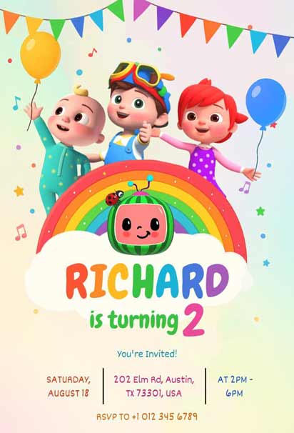
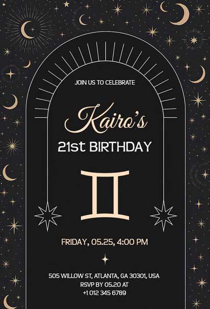
Birthday Invitation Card Design Tips
Birthday invitations require a balance of fun and information. The design should reflect the birthday person’s personality while communicating party details. For ready-to-use designs, explore our birthday invitation templates that cater to different age groups and themes.
Age-Appropriate Design Elements:
Designing invitations with age in mind helps set the right tone and appeal to the guest of honor. Each age group responds to different colors, themes, and layouts that reflect their stage in life.
Children’s Parties (Ages 1-12): Bright colors, cartoon characters, playful fonts, and interactive elements like pop-ups or scratch-off sections. These fun features instantly grab kids’ attention and make the invitation feel like part of the celebration. Parents will appreciate designs that are both engaging and easy to read.
Teen Parties (Ages 13-17): Trendy color schemes, social media-inspired layouts, and modern typography that reflects current design trends. Incorporating hashtags, emojis, or QR codes can make the invitation feel more personalized and tech-savvy, resonating well with teens’ digital lifestyles.
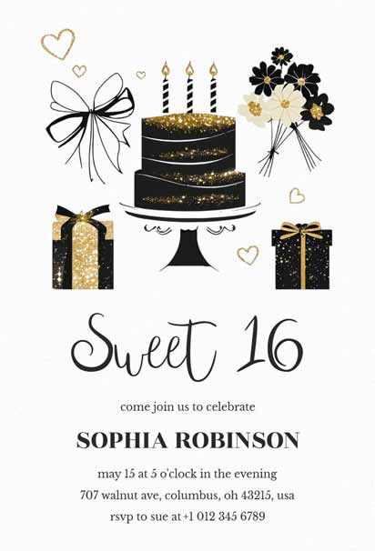
Adult Parties (Ages 18-59): Sophisticated color palettes, elegant typography, and themes that reflect personal interests or milestone significance. Adding minimalistic graphics or stylish accents can enhance the invitation’s classy appeal while keeping it modern and relevant.
Senior Celebrations (Ages 60+): Classic designs with larger text, traditional color schemes, and nostalgic elements that resonate with their generation. Incorporating vintage patterns or family-themed motifs can add a heartfelt touch that honors their legacy and life journey.
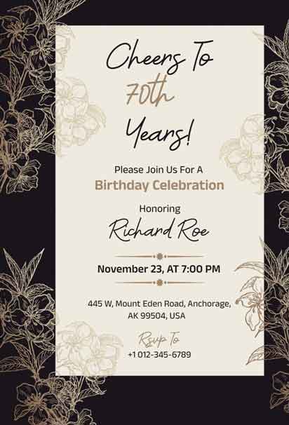
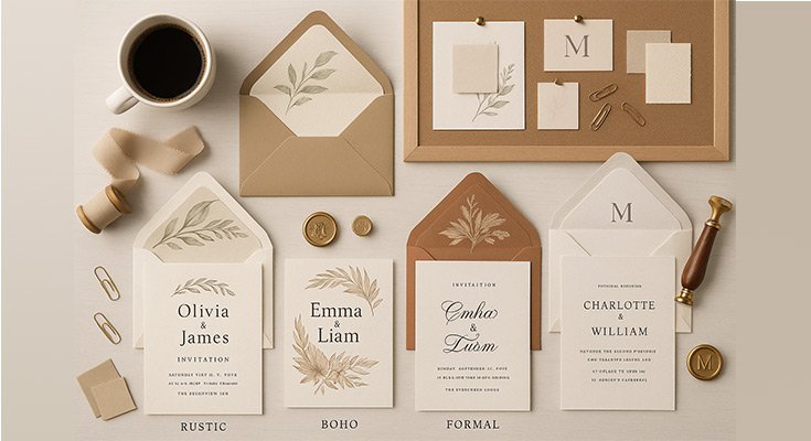
Wedding Invitation Card Design Guidelines
Wedding invitations set expectations for your entire celebration. They should reflect your wedding style, venue, and personal taste while providing all necessary information clearly. For inspiration and guidance, explore our wedding invitation designs. Browse our collection of engagement invitation templates to find designs that match your vision.
Essential Wedding Invitation Elements:
- Primary Information: Couple’s names, ceremony date and time, venue address
- Reception Details: Location, time, dress code, if applicable
- RSVP Information: Contact method and response deadline
- Additional Cards: Save-the-dates, reception cards, accommodation information
According to UCLA’s Event Planning guide, wedding invitation suites should include clear components: host names, event details (“who, what, when, where”), RSVP instructions (reply card or contact), attire/directions, and a separate map insert for off‐campus guests.1
Popular Wedding Invitation Styles:
- Classic Elegant: Traditional fonts, neutral colors, minimal embellishments
- Modern Minimalist: Clean lines, abundant white space, contemporary typography
- Rustic Charm: Natural textures, earth tones, hand-lettered elements
- Vintage Romance: Antique-inspired fonts, soft pastels, decorative borders
Corporate Event Invitation Design
Corporate invitations require professional aesthetics while maintaining visual interest. They should align with company branding and convey the event’s importance and formality level. Our formal invitation templates provide professional designs suitable for business events.
Corporate Design Considerations:
- Brand Integration: Incorporate company colors, logos, and typography consistently
- Professional Tone: Use formal language and sophisticated design elements
- Clear Information Hierarchy: Business events often have complex details requiring an organized presentation
- Networking Focus: Include information about attendees, speakers, or networking opportunities
Baby Shower Invitation Design Elements
Baby shower invitations typically feature soft color palettes, whimsical illustrations, and playful typography. Include baby-related imagery thoughtfully, focus on celebrating the parents-to-be, and maintain readability for essential details. Find inspiration in our comprehensive guide to baby shower invitation ideas for more design tips.
Holiday Party Themed Invitation Ideas
Holiday invitations can embrace seasonal colors and imagery while maintaining readability and professionalism. Balance festive elements with clear information presentation for effective communication. Incorporate classic motifs like snowflakes, ornaments, or twinkling lights to evoke the holiday spirit. Choose elegant typography and structured layouts to ensure your invite feels celebratory yet polished.
How Do I Choose the Right Color Scheme for My Event Type?
Color choices significantly impact how recipients perceive your event and their likelihood of attending. Understanding color psychology helps create invitations that evoke desired emotions and responses.
Meaning: Romance, femininity, warmth
Best for: Baby girl showers, bridal events, intimate gatherings
Design Tip: Modern pink palettes include dusty rose and blush tones for sophisticated appeal
Primary Color Meanings and Applications
Red: Excitement, passion, urgency
- Best for: Valentine’s parties, anniversary celebrations, holiday events
- Design tip: Use as an accent color rather than a dominant shade to avoid overwhelming recipients
Blue: Trust, stability, professionalism
- Best for: Corporate events, baby boy showers, graduation parties
- Design tip: Combine with complementary colors to prevent a cold or impersonal feeling
Green: Growth, harmony, nature
- Best for: Outdoor events, eco-friendly celebrations, spring gatherings
- Design tip: Use different shades to create depth and visual interest
Purple: Luxury, creativity, spirituality
- Best for: Milestone birthdays, artistic events, upscale gatherings
- Design tip: Balance rich purples with lighter tones to maintain readability
Yellow: Joy, optimism, energy
- Best for: Summer parties, children’s events, casual celebrations
- Design tip: Use carefully as a primary color; it can be difficult to read in certain combinations
Pink: Romance, femininity, warmth
- Best for: Baby girl showers, bridal events, intimate gatherings
- Design tip: Modern pink palettes include dusty rose and blush tones for sophisticated appeal
When applying these invitation card design tips, always consider your audience and the event atmosphere you want to convey. A well-chosen color scheme ensures your invitation makes a memorable first impression while staying aligned with your celebration’s tone.
Color Combination Strategies
- Monochromatic Schemes: Using different shades of the same color creates sophisticated, cohesive designs perfect for formal events.
- Complementary Colors: Opposite colors on the color wheel create high contrast and visual impact, making them ideal for events that require attention-grabbing invitations.
- Analogous Colors: Adjacent colors on the color wheel provide harmony and are easy on the eyes, suitable for relaxed, intimate gatherings.
- Triadic Colors: Three evenly spaced colors create vibrant, balanced designs while maintaining visual interest without overwhelming recipients.
What Fonts Work Best for Different Types of Invitations?
Typography communicates your event’s personality and ensures information accessibility. Poor font choices can make even beautifully designed invitations ineffective.
Font Category Guidelines
Serif Fonts: Traditional, formal, readable
- Best applications: Wedding invitations, formal events, traditional celebrations
- Examples: Times New Roman, Garamond, Georgia
- Design tip: Pair with sans-serif fonts for modern contrast
Sans-Serif Fonts: Modern, clean, approachable
- Best applications: Corporate events, contemporary celebrations, digital invitations
- Examples: Helvetica, Arial, Futura
- Design tip: Excellent for primary information due to high readability
Script Fonts: Elegant, personal, decorative
- Best applications: Wedding invitations, bridal showers, romantic events
- Examples: Brush Script, Pacifico, Dancing Script
- Design tip: Use sparingly; limit to names or event titles for maximum impact
Display Fonts: Unique, thematic, attention-grabbing
- Best applications: Theme parties, children’s events, creative celebrations
- Examples: Comic Sans (children), Bebas Neue (modern), Playfair Display (elegant)
- Design tip: Reserve for headlines only; pair with simple fonts for body text
Typography Hierarchy Implementation
- Primary Text (Event Title/Names): Largest size, distinctive font, high contrast with background
- Secondary Text (Date/Time/Location): Medium size, easily readable font, clear visual separation from primary text
- Tertiary Text (RSVP/Additional Details): Smaller size, simple font, organized for easy scanning
Font Size Guidelines for Print:
- Primary text: 18-24 points
- Secondary text: 12-16 points
- Tertiary text: 10-12 points
- Fine print: 8-10 points (minimum for readability)
How Do I Create Visual Hierarchy in My Invitation Design?
Effective layout guides the reader’s eye through information naturally while creating visual appeal. Professional designers use specific techniques to achieve balanced, engaging compositions.
The Rule of Thirds in Invitation Design
Dividing your invitation into nine equal sections using two horizontal and two vertical lines creates natural focal points where lines intersect. Placing important elements at these intersections creates more dynamic, visually appealing designs than centering everything.
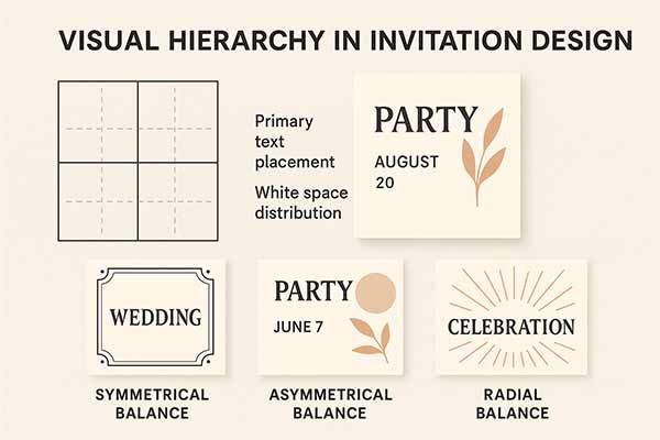
Practical Applications:
- Primary text placement: Position event names or titles at the upper or lower intersection points
- Image positioning: Place decorative elements or photos along grid lines rather than centered
- White space distribution: Use the grid to create balanced empty spaces that give designs room to breathe
Visual Balance Strategies:
- Symmetrical Balance: Mirror elements on both sides of a central axis, creating formal, stable designs perfect for traditional events.
- Asymmetrical Balance: Distribute visual weight unevenly while maintaining overall balance through color, size, or positioning adjustments.
- Radial Balance: Arrange elements around a central point, creating dynamic, energetic designs suitable for celebratory events.
White Space Utilization:
White space (negative space) provides visual rest and emphasizes important elements. Proper white space usage prevents cluttered, overwhelming designs.
White Space Best Practices:
- Margins: Maintain consistent borders around invitation edges (minimum 0.25 inches for print)
- Text spacing: Provide adequate line height (1.2- 1.5x font size) for comfortable reading
- Element separation: Use white space to group related information and separate distinct sections
- Breathing room: Allow decorative elements space to stand out without competing with text
What Information Should Be Included on My Invitation Card?
Organizing invitation information logically ensures recipients find all necessary details quickly while maintaining visual appeal.
Information Hierarchy Framework
Organizing invitation content by importance ensures clarity and improves readability. This framework helps guests quickly find essential details while still accessing helpful extras when needed.
1 – Primary Information (Must be immediately visible):
- Event type or celebration reason
- Host names (for personal events) or organization name (for corporate events)
- Event date and day of week
- Event time (start time minimum, end time if relevant)
2 – Secondary Information (Should be easily findable):
- Venue name and full address
- Dress code or special instructions
- RSVP deadline and contact method
- Gift preferences or registry information
3 – Tertiary Information (Can be smaller or on back):
- Parking information
- Accommodation suggestions
- Weather contingency plans
- Additional contact information
RSVP Integration Strategies
Modern RSVP methods should accommodate different guest preferences while making response tracking manageable for hosts.
Traditional RSVP Methods:
- Phone responses: Include a dedicated phone number with specific calling hours
- Mail responses: Provide pre-addressed, stamped response cards with a clear deadline
- Email responses: Use a dedicated email address with a clear subject line format
Digital RSVP Solutions:
- QR codes: Link to online RSVP forms for smartphone-savvy guests
- Website integration: Direct guests to event websites with RSVP functionality
- Social media integration: Private event pages for casual gatherings
Hybrid Approaches:
- Multiple options: Offer both traditional and digital methods to accommodate all guests
- Clear instructions: Specify which method hosts prefer while providing alternatives
- Consistent tracking: Use systems that compile responses from all methods into a single database
What Tools and Resources Should You Use for Invitation Design?
Modern design tools make professional invitation creation accessible to non-designers while offering advanced features for experienced users.
Best Online Design Tools Comparison
Popular platforms like 1invites, Canva, Adobe Creative Suite, and specialized invitation design tools each offer different advantages. Consider your skill level, budget, and specific feature requirements when choosing design software.
AI-Powered Design Assistants and Templates
Artificial intelligence tools can suggest color palettes, font combinations, and layout improvements based on your content and preferences. These tools accelerate the design process while maintaining professional standards.
When to Use Professional Design Services
Complex designs, tight deadlines, or high-stakes events may warrant professional design services. Understand when the investment in professional help provides better value than DIY approaches.
What Are the Best Printing Methods for Invitation Cards?
Print quality significantly impacts invitation effectiveness and recipient perception. Understanding printing specifications ensures professional results. (If you’re planning to print, here’s what you need to know about invitation card makers for physical cards, especially the paper selection part.
Paper Types and Their Applications
Choosing the right paper type enhances both the look and feel of your invitation. From weight to finish, each option contributes to the tone and impression of your event.
Cardstock Weight Guidelines:
- 80-100 GSM: Standard weight, suitable for casual events, budget-friendly
- 120-160 GSM: Premium weight, professional feel, good for most applications
- 200+ GSM: Luxury weight, formal events, highest quality perception
Paper Finish Options:
- Matte finish: Reduces glare, elegant appearance, and easy to write on
- Glossy finish: Vibrant colors, photo-quality images, modern feel
- Linen texture: Classic, sophisticated texture, traditional events
- Recycled options: Eco-friendly choice, subtle texture variations
Print Specifications
Proper print settings ensure your invitation design looks polished and professional when produced. Attention to resolution, color modes, and layout margins is key to avoiding costly printing errors.
Resolution Requirements:
- Minimum resolution: 300 DPI for professional print quality
- Image quality: High-resolution photos prevent pixilation in print
- Vector elements: Use vector graphics when possible for scalability
Color Mode Considerations:
- CMYK mode: Required for professional printing (Cyan, Magenta, Yellow, Black)
- RGB to CMYK conversion: Colors may shift; review proofs before final printing
- Pantone colors: Specify exact colors for brand consistency in large print runs
Bleed and Margin Requirements:
- Bleed area: Extend design 0.125 inches beyond the trim line
- Safe zone: Keep important elements 0.25 inches from edges
- Trim marks: Include for professional cutting accuracy
Should I Choose Digital or Print Invitations for My Event?
Modern invitation strategies often combine digital and print elements to maximize reach and convenience while accommodating different guest preferences. (Going digital for the first time? You might find this digital invitation maker walkthrough helpful for avoiding common pitfalls.)
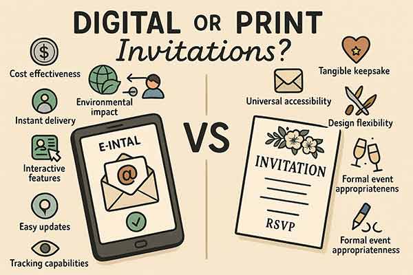
Digital Invitation Advantages
- Cost Effectiveness: No printing or postage costs, especially beneficial for large guest lists or tight budgets.
- Environmental Impact: Reduces paper usage and transportation-related carbon footprint.
- Instant Delivery: Immediate sending and receiving, ideal for last-minute events or time-sensitive invitations.
- Interactive Features: Embedded maps, RSVP forms, event websites, and social sharing capabilities.
- Easy Updates: Modify details and resend without reprinting costs or delays.
- Tracking Capabilities: Monitor open rates, RSVP responses, and guest engagement levels.
Print Invitation Benefits
- Tangible Keepsake Value: Physical invitations become memorable souvenirs that guests often save.
- Perceived Importance: Print invitations suggest event significance and host investment in guest experience.
- Universal Accessibility: Reaches guests regardless of technological comfort or internet access.
- Design Flexibility: Premium paper, textures, and finishing options are unavailable in digital formats.
- Formal Event Appropriateness: Traditional expectations for weddings, corporate events, and milestone celebrations.
Hybrid Approach Implementation
- Save-the-Date Digital, Invitation Print: Send digital save-the-dates for early planning, follow with printed formal invitations.
- Print Primary, Digital Details: Mail printed invitations with QR codes linking to detailed event websites.
- Generational Considerations: Send print invitations to older guests, digital to younger recipients.
- Event Type Matching: Use digital for casual events, print for formal occasions, and hybrid for semi-formal gatherings.
What Are Common Invitation Design Mistakes to Avoid?
Understanding frequent invitation design errors helps create more effective, professional-looking invitations.
Typography Errors
Too Many Fonts: Using more than three font families creates visual chaos and appears unprofessional.
- Solution: Limit to two fonts maximum; use font weights and sizes for variety
Poor Readability: Decorative fonts for body text or insufficient color contrast make information difficult to read.
- Solution: Reserve decorative fonts for headlines; ensure high contrast between text and background
Inconsistent Sizing: Random font sizes without logical hierarchy confuse information importance.
- Solution: Create clear size relationships: headlines largest, body text medium, details smallest
According to MIT’s User Interface Design course, typography errors such as poor kerning can lead to visual misinterpretation, reducing readability and user engagement.2
Color and Contrast Issues
Insufficient Contrast: Light text on light backgrounds or dark text on dark backgrounds reduces readability.
- Solution: Test contrast ratios; aim for a minimum 4.5:1 ratio for normal text
Color Overload: Using too many colors creates overwhelming, unprofessional appearances.
- Solution: Limit palette to 3-4 colors maximum; use tints and shades for variety
Cultural Color Misunderstandings: Colors carry different meanings across cultures and may send unintended messages.
- Solution: Research color meanings for your audience; consider cultural sensitivities
Layout and Spacing Problems
Cramped Design: Filling every space with text or graphics creates cluttered, overwhelming invitations.
- Solution: Embrace white space; allow elements room to breathe
Poor Alignment: Random element placement without consistent alignment points appears amateurish.
- Solution: Use alignment guides; maintain consistent margins and spacing
Information Overload: Including too much detail on the invitation front creates confusion about essential information.
- Solution: Prioritize information; move secondary details to the back or separate cards
How Do I Match My Invitation Design to Different Event Themes?
Different seasons and themes require specific design approaches to create an appropriate atmosphere and meet guest expectations.
Spring Event Design Elements
- Color Palettes: Soft pastels, fresh greens, light blues, and warm yellows reflect spring renewal and growth.
- Natural Elements: Floral patterns, botanical illustrations, and garden imagery connect with spring themes.
- Typography Choices: Light, airy fonts with organic curves complement natural spring themes.
- Texture Applications: Watercolor effects, hand-painted elements, and soft gradients create spring freshness.

Summer Celebration Strategies
- Vibrant Colors: Bold, energetic colors like coral, turquoise, and sunshine yellow capture summer energy.
- Outdoor Themes: Beach elements, tropical patterns, and sunshine motifs work well for summer events.
- Casual Typography: Relaxed, informal fonts reflect summer’s laid-back atmosphere.
- Weather Considerations: Include outdoor event contingency information and dress recommendations.

Fall/Autumn Design Approaches
- Warm Color Schemes: Rich oranges, deep reds, golden yellows, and earthy browns create autumn warmth.
- Seasonal Elements: Leaf patterns, harvest imagery, and rustic textures complement fall themes.
- Cozy Typography: Warm, comfortable fonts with slight vintage touches work well for autumn events.
- Indoor Focus: Emphasize warmth and comfort for events moving indoors as the weather cools.

Winter Event Considerations
- Cool Color Palettes: Deep blues, silver, white, and burgundy create winter elegance and warmth.
- Holiday Integration: Consider proximity to holidays; avoid competition or embrace seasonal celebrations.
- Formal Typography: Elegant, sophisticated fonts match winter’s formal season and holiday events.
- Practical Information: Include weather contingencies, parking information, and appropriate attire suggestions.

How Do I Ensure My Invitation Is Accessible to All Guests?
Creating inclusive invitations ensures all guests can access event information regardless of visual abilities or other accessibility needs.
Visual Accessibility Guidelines
Color Contrast Requirements: Maintain minimum contrast ratios for text readability across different vision types.
- Normal text: 4.5:1 contrast ratio minimum
- Large text: 3:1 contrast ratio minimum
- Testing tools: Use online contrast checkers to verify accessibility
Font Size Considerations: Ensure text remains readable for guests with varying visual abilities.
- Minimum sizes: 12-point font for body text, larger for guests over 65
- Sans-serif preference: Generally more readable for accessibility than decorative fonts
- Font weight: Medium or bold weights improve readability over light weights
Color-Independent Information: Don’t rely solely on color to convey important information.
- Multiple indicators: Use icons, text, or patterns alongside color coding
- Colorblind considerations: Test designs with colorblind simulation tools
- High contrast alternatives: Provide alternative format options when requested
Information Accessibility
Clear Language: Use simple, direct language that’s easily understood by all education levels.
- Avoid jargon: Explain specialized terms or abbreviations
- Cultural considerations: Use inclusive language that welcomes diverse backgrounds
- Translation options: Consider bilingual invitations for multicultural guest lists
Format Options: Offer alternative invitation formats to accommodate different needs.
- Large print versions: Available upon request for guests with vision limitations
- Digital accessibility: Screen-reader compatible digital versions
- Audio options: Phone-based invitation details for guests preferring audio information
Inclusive Design Practices
Universal Design Principles: Create invitations that work well for the widest range of abilities.
- Simple layouts: Clear, logical information organization
- Consistent formatting: Predictable design patterns throughout the invitation
- Error prevention: Clear RSVP instructions that minimize confusion
How Do I Incorporate Cultural Elements Appropriately in My Invitation?
Understanding cultural differences ensures invitations are appropriate and respectful for diverse audiences.
Color Meanings Across Cultures
Colors carry different symbolic meanings across cultures, which can influence how your invitation is perceived. Being mindful of these cultural associations ensures your design is respectful and well-received.
Red Significance Variations:
- Western cultures: Romance, passion, excitement
- Chinese culture: Luck, prosperity, celebration (ideal for weddings)
- Indian culture: Purity, fertility (traditional wedding color)
- South African culture: Mourning (avoid for celebrations)
White Color Interpretations:
- Western cultures: Purity, elegance, cleanliness
- Asian cultures: Mourning, death (inappropriate for celebrations)
- Middle Eastern cultures: Purity, peace (generally positive)
Other Cultural Color Considerations:
- Purple: Royalty in many cultures, but mourning in some Asian traditions
- Yellow: Joy in Western cultures, but sacred/imperial in some Asian contexts
- Green: Nature and growth universally, but vary in religious significance
Religious and Cultural Sensitivity
Religious Holiday Awareness: Schedule consideration for major religious observances that might affect attendance.
- Research tools: Use interfaith calendars to check for conflicts
- Inclusive scheduling: Choose dates that don’t exclude significant portions of your guest list
- Alternative accommodations: Provide options for guests observing religious restrictions
Dietary Considerations: Include relevant dietary information for culturally diverse groups.
- Common restrictions: Vegetarian, vegan, halal, kosher, allergies
- Clear labeling: Specify food preparation methods when relevant
- Alternative options: Ensure inclusive menu choices for all guests
Language Considerations: Multilingual invitations for diverse communities.
- Translation accuracy: Use professional translation services for important events
- Cultural adaptation: Adapt concepts, not just words, for cultural appropriateness
- Format considerations: Some languages read right-to-left, affecting the design layout
How Do I Measure My Invitation’s Effectiveness?
Tracking invitation performance helps improve future designs and understand what resonates with your audiences.
Response Rate Metrics
Understanding RSVP trends helps evaluate the effectiveness of your invitations. Tracking responses and attendance patterns can guide future improvements in design and communication strategy.
RSVP Response Rates:
- Industry averages: 70-80% for personal events, 60-70% for corporate events
- Tracking methods: Digital RSVP systems provide automatic tracking; manual tracking is required for traditional methods
- Follow-up strategies: Plan reminder communications for non-respondents
Attendance Correlation:
Compare RSVP responses to actual attendance rates to understand invitation effectiveness.
- No-show patterns: Track patterns to improve future event planning
- Last-minute changes: Monitor how invitation clarity affects change requests
- Satisfaction correlation: Survey attendees about invitation influence on attendance decisions
Guest Feedback Collection
Collecting feedback on your invitations offers valuable insights into what resonates with your audience. It helps refine future designs by highlighting strengths and areas for improvement.
Invitation-Specific Feedback:
- Design appeal: Ask guests about visual elements that influenced their attendance decision
- Information clarity: Gather feedback about invitation completeness and clarity
- Accessibility: Check whether all guests could access and understand the invitation information
Improvement Identification:
- Design elements: Which colors, fonts, or layouts received positive responses
- Information organization: How well did guests find essential event details
- Technology preferences: Digital vs. print preferences among different guest segments
A/B Testing for Future Events
A/B testing helps identify which design and content elements drive better engagement and RSVP rates. By experimenting with variations, you can optimize invitations for future event success.
Design Element Testing:
- Color variations: Test different color schemes with similar guest groups
- Layout options: Compare response rates for different information organizations
- Format preferences: Test digital vs. print effectiveness for your audience
Content Testing:
- Tone variations: Formal vs. casual language impact on response rates
- Information depth: Minimal vs. detailed invitation effectiveness
- Call-to-action effectiveness: Different RSVP request approaches and their success rates
What Are the Latest Trends in Invitation Card Design?
Staying current with design trends helps create invitations that feel fresh and contemporary while maintaining timeless appeal.
Technology Integration Trends
Augmented Reality (AR) Invitations: QR codes linking to AR experiences that provide immersive event previews.
- Implementation: Simple AR apps that show venue tours or event atmosphere
- Accessibility: Ensure AR features enhance rather than replace essential information
- Cost considerations: Balance technology costs with guest experience benefits
NFC-Enabled Invitations: Near Field Communication chips embedded in physical invitations for instant digital interactions.
- Functionality: Tap to access event websites, add calendar events, or connect to social media
- Target audience: Tech-savvy guests who appreciate innovative interactions
- Backup plans: Always include traditional access methods for technology-averse guests
Interactive Digital Elements: Animations, videos, and interactive features in digital invitations.
- Engagement benefits: Higher open rates and response rates for well-executed interactive elements
- Loading considerations: Ensure fast loading times across different devices and internet speeds
- Accessibility: Provide static alternatives for screen readers and accessibility tools
Sustainable Design Practices
Eco-Friendly Materials: Increased demand for sustainable paper and printing options.
- Recycled content: High-quality recycled papers are now available in premium weights
- Alternative materials: Seed paper, bamboo, and other sustainable options are gaining popularity
- Local sourcing: Reduced transportation impact through local printing partnerships
Digital-First Strategies: Reducing environmental impact through primarily digital approaches.
- Print by exception: Only printing when specifically requested or required by formality
- Digital keepsakes: Creating memorable digital experiences that replace physical mementos
- Carbon offset options: Partnerships with environmental organizations for remaining print needs
Personalization Technologies
Variable Data Printing: Mass customization that personalizes each invitation while maintaining design consistency.
- Name integration: Seamless integration of guest names into design elements
- Photo customization: Including relevant photos or memories for each recipient
- Interest targeting: Customizing design elements based on known guest preferences
AI-Assisted Design: Artificial intelligence tools that help create personalized designs efficiently.
- Style matching: AI analysis of preferences to suggest appropriate design directions
- Content optimization: Automated suggestions for improving invitation effectiveness
- Accessibility enhancement: AI-powered accessibility checking and improvement suggestions
These AI tools are getting pretty impressive. Here’s how AI invitation makers actually work in practice.
People Also Ask
Elegant serif fonts like Garamond or Playfair Display work best for formal weddings, while modern sans-serif fonts like Montserrat suit contemporary celebrations. Script fonts should be limited to names or titles only.
Limit your color palette to 3-4 colors maximum to maintain visual cohesion. Use different shades and tints of your chosen colors to create variety without overwhelming the design.
Standard invitation sizes are 5″x7″ for most events, 4.25″x6″ for casual gatherings, and 5.5″x8.5″ for formal events like weddings. Choose based on your event’s formality and information requirements.
Every invitation must include the five W’s and H: Who (host), What (event type), When (date and time), Where (venue and address), Why (occasion), and How (RSVP information).
Use consistent fonts (maximum 2-3 font families), maintain proper contrast ratios, align elements consistently, leave adequate white space, and ensure all text is easily readable.
Conclusion
Creating effective invitation cards requires balancing artistic vision with practical communication needs. The best invitation card designs combine visual appeal with clear information hierarchy, appropriate cultural sensitivity, and accessibility considerations that ensure all guests feel welcomed and informed.
Remember these key invitation card design tips as you create your next invitation:
- Prioritize Information Clarity: Your invitation’s primary purpose is to communicate event details effectively. Beautiful design should enhance, never obscure, essential information.
- Know Your Audience: Consider your guests’ demographics, cultural backgrounds, and technology comfort levels when making design decisions.
- Test Before Finalizing: Whether testing color contrast for accessibility or printing a sample to check quality, testing prevents costly mistakes and ensures professional results.
- Plan for Follow-Up: Great invitations are part of comprehensive communication strategies that include save-the-dates, reminders, and post-event thank-you communications.
The invitation card design landscape continues evolving with new technologies, sustainability concerns, and changing social expectations. By understanding fundamental design principles while staying aware of current trends, you can create invitations that not only look professional but also effectively serve their primary purpose: bringing people together for meaningful celebrations.
Reference
- “Review the Basic Elements of an Invitation, Reply Card, and Map Insert”. Retrieved June 16, 2025. University of California.
- “Reading 16: Typography – MIT 6.813/6.831 User Interface Design.” Archived from the original on April 2018. Retrieved June 16, 2025. Massachusetts Institute of Technology.